Heritage and history
Flying the flag for the Royal Docks' seafaring history
Walking beside the tranquil waters of Royal Victoria Dock, it's hard to imagine how raucous this place once was.
In its shipping heyday, this quayside would have been bustling with dockworkers unloading boatfuls of fruit and tobacco, lines of cranes rising and falling, whole pig carcasses being winched ashore, and occasionally even a live elephant.
The Royal Docks’ logo is inspired by this past, as well as the area’s present and future. Watch this video to find out how:
This was a central artery of late 19th and early 20th century global commerce, the place for merchants to transport their goods speedily into the heart of London. The noise of the docklands is gone, but the international frame of reference of the Royal Docks is still embodied here in more subtle forms: through London City Airport’s network of connections and the ExCeL’s impressive roster of conferences.
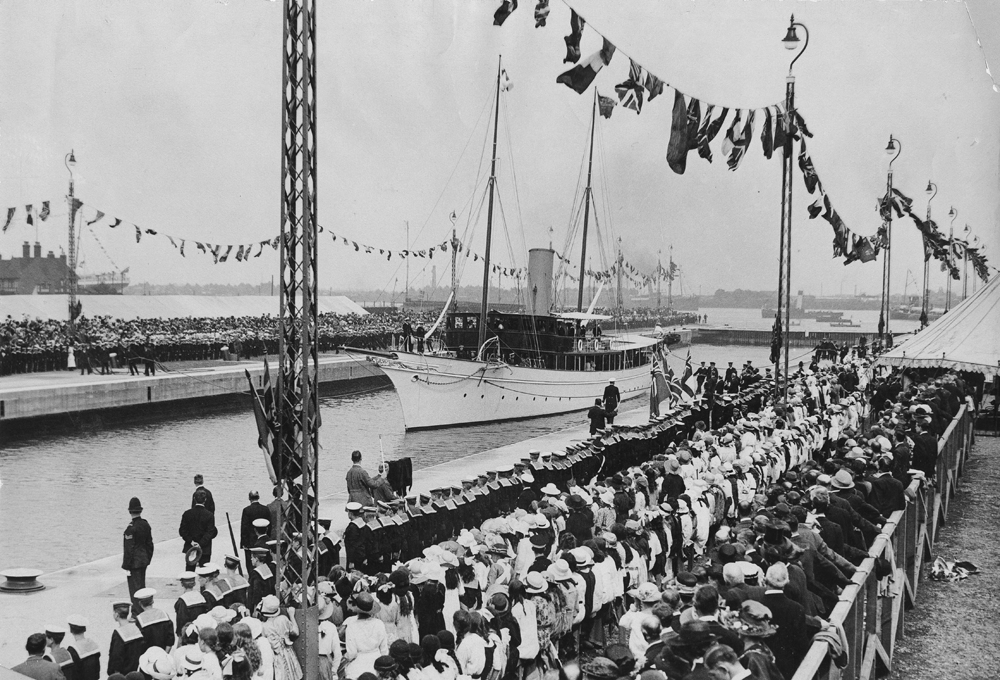
King George V Dock opening in 1921
Photo: Museum of London
In the very year that the first dock opened — 1855 — the British Board of Trade drew up a maritime alphabet of flags for vessels to communicate in open water. Known as the International Code of Signals, you can spot these flags today in shipping lanes across the globe. Their universal meanings allows ships from countries all over the world to send and receive messages in a common language.
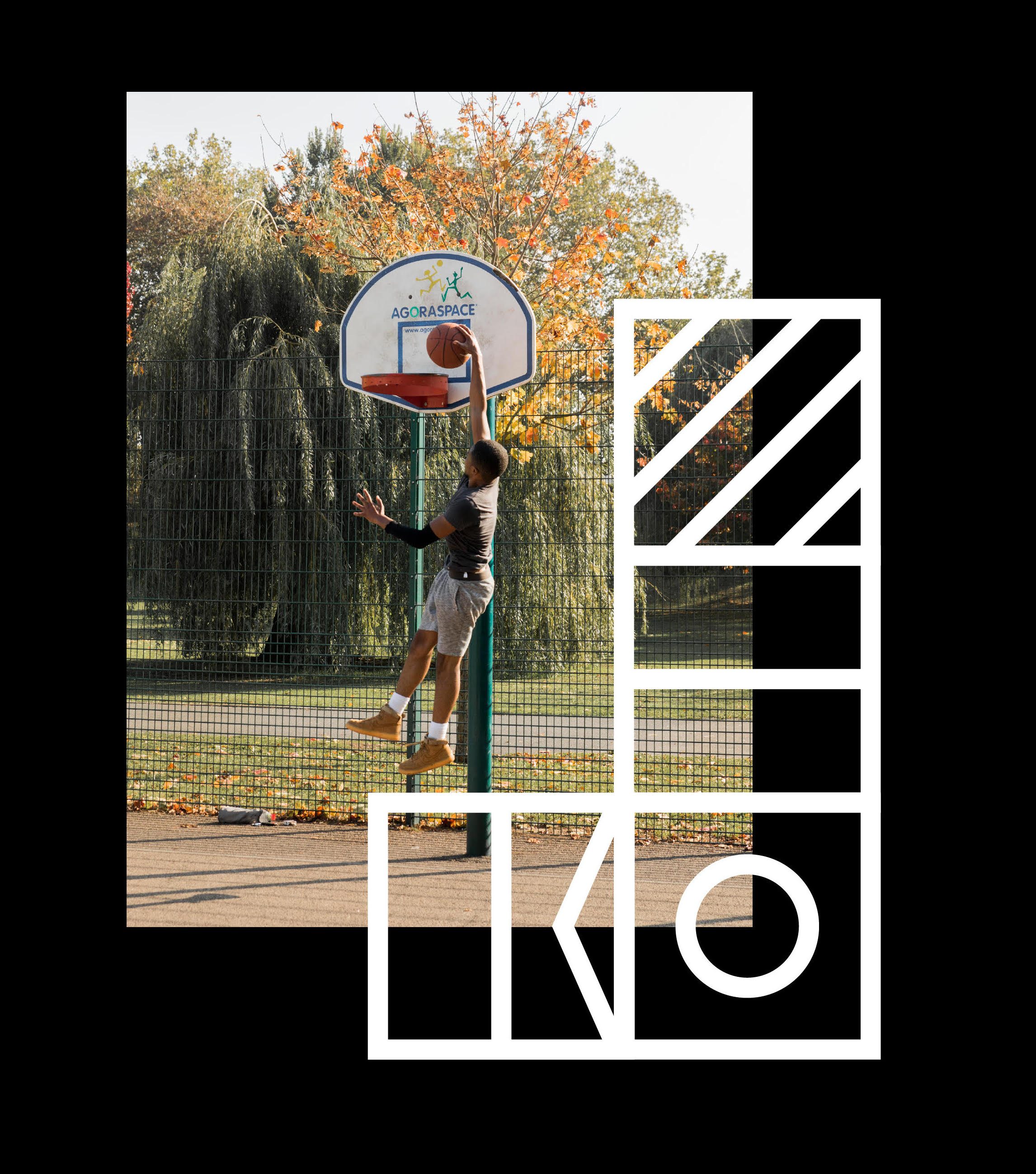
The logo takes the R for Royal and D for Docks from the code, making a plus and an equals. The plus is a symbol of positivity, addition, and togetherness. The equals signifies results, doings, and progress. Together, they encapsulate the Royal Docks past and future, both as an existing place and a regeneration project that will come to define what good growth looks like.
Like the docks themselves, the black and white colour scheme is bold, clear, and functional. This monochromatic palette doesn’t interrupt or explain, instead it acts as a frame for the people and stories of the area. It's intentionally simple, letting the beauty of this place come through.
The black and white colour scheme acts as a frame for the people and stories of the area.
This is just the beginning of the Royal Docks conversation, a year-long collaborative process in which we invite local people and businesses to help us shape detailed plans for the Royal Docks. It’s a consultation, yes, but it’s much more than that. This dialogue will be the beginning of a bottom-up development process in which everyone is welcome to take a lead.
We’ll be announcing a dedicated space with drop-in facilities, community events, and online engagement — so that everyone’s voice can be heard. Read more here or learn about how this is London's only Enterprise Zone.
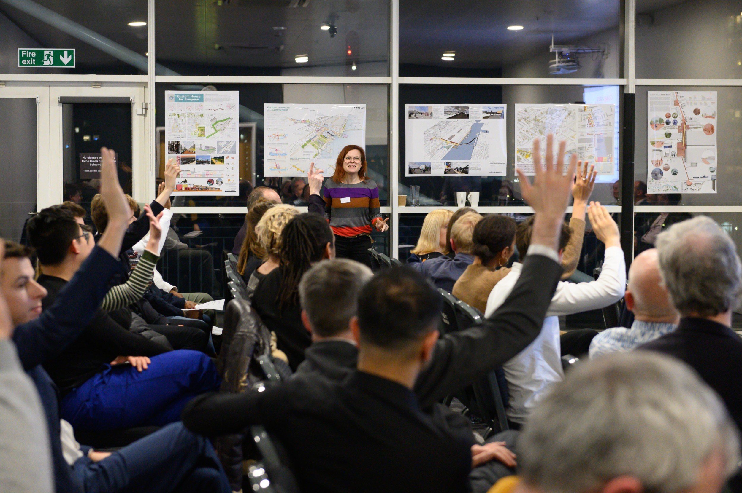
LFA's Royal Docks workshop
The conversation has already begun. Find out about our workshop in collaboration with the London Festival of Architecture.